 SEO Utah
How to Make Your Site Mobile Friendly
 In recent posts, we’ve talked about the upcoming Mobilegeddon (which is already upon us) and how to determine if your site is SEO friendly or not. Today we’re going to give a couple of resources to look at if your site comes back as not SEO friendly. With most things, there’s an easy way and a hard way.
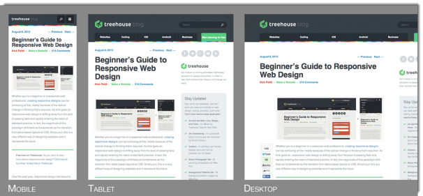
Too note, there are several ways by which you can make your site mobile friendly – the two main styles are making it responsive (creating a fluid like design that responds to the display/media type) and making it adaptive (creating several different designs with specific sizing for different designs). That discussion of which is better can be left for you to choose. Hear, we’ll largely be talking about responsive solutions.
Easy Way – WordPress
While some may debate whether WordPress is the best platform or not to host your site on, we have to say that from personal experience we strongly agree. Having worked with several different CMS platforms as well as several different types of static sites, WordPress continually appears as one the easiest to implement and use and yet one of the most dependable and powerful. You can do everything from host a simple blog to turn it into a robust eCommerce site. WordPress is also so easy to update and add further capabilities to – such as easy social sharing, list building, SEO compatibility, and even mobile responsiveness.
Yes, in many sites, mobile friendliness can be attained simply by adding a mobile plug-in. With a little bit of work to make it look good and unique, your site could be mobile friendly very quickly and can often be done by even a novice to web design with a WordPress plug-in. Some of the most common WordPress Plug-ins for making a site mobile friendly are:
- Jetpack by WordPress.com
- WPtouch Mobile Plugin
- WP Mobile Detector
- WordPress Mobile Pack 2.0
 Hard Way – Any Other Way Than a Plug-in (Via WordPress)!
Yes, for novices, any other way than a plug-in or a simple line of code will be harder to implement, but doesn’t make it any less important or needed on sites outside of WordPress (or other comparable CMS platforms with mobile plug-ins or extensions.) A great place to start here is to look again to our favorite search leader Google. Google actually has a pretty thorough explanation of creating mobile friendly websites as well as some of the common pitfalls mobile friendly coding can create for search engines. Very nice of them to give us such insight into the design and implementation. They have a solid section of mobile information at https://developers.google.com/webmasters/mobile-sites/get-started/?hl=en.
In addition, another great resource in helping you understand mobile design experience even further is https://www.edx.org/course/building-mobile-experiences-mitx-21w-789x. That mobile course is offered by MIT for free through edX. However, this is not really an easy to get going course for newbies, but is great for developers or intermediate coders.
For novices, we can’t help but recommend simply using the WordPress platform and implementing one of their plug-ins to make your website SEO friendly. If you want to keep your current platform or straight code, then the Google and MIT resources are great to help you understand the most important elements and even a little deeper. With that being said, the importance of simply partnering with an agency to cannot be understated. Use their skills to help make the process so much easier and more pleasurable for yourself as well knowing that the design is done in the best way for both your rankings and your users. Check out Barking Frog SEOs mobile website design capabilities as well as their solid local search engine optimization abilities if you’re looking for an agency that can truly get you the rankings you deserve and ensure that your site is mobile friendly.