 Mobile Marketing Utah
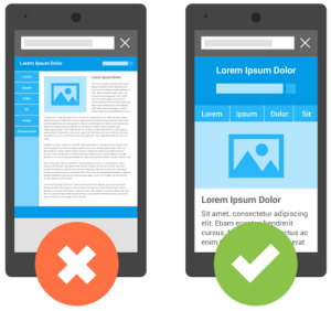
How To Make Sure Your Site Is Mobile-Friendly
 So, Mobilegeddon has come and gone and it appears the world as we know it is still standing. However, have you checked your mobile rankings? How are they doing? Has your site continued to rank well even with the change in the mobile ranking algorithm or did you get hit because your site is not mobile-friendly? Well, if you’re not sure, this is the insight we had promised in an earlier post – how to make sure your site is mobile friendly.
Google’s Rules – Use Google’s Tools
Google has seen the increase of mobile usage and search and has realized for some time that many website are not optimized to display on mobile devices properly. In a effort to provide the best results to their users. Since it is Google that has made a “Google-god” choice in changing the algorithms, it’s probably best to utilize their methods of determining if a site is mobile-friendly or not. Thankfully they have given such tools.
For individual URLs – their method by which you can check individual pages for their mobile-friendliness is a helpful URL checker at https://www.google.com/webmasters/tools/mobile-friendly/. This method allows you just check one URL at a time and allows you to check any URL that you would like – whether you have control of the site or not. For the result it gives you a screenshot of how Google is seeing it in “mobile” form and can be very helpful for you to see this if you have not seen your site in its mobile version before. They also give bullet point issues that need to be corrected such as the text and images not changing size to fit into a mobile presentation effectively. In addition, you can also use this method to do a little competitive research if you don’t have another means by which to see the mobile version of a page. Put your competitors URL in the test and see what their screenshot looks like. This may also help you determine the format that you would like your mobile version of the page in as well.
For site wide adherence check, Google recommends you simply add your site to Google Webmaster Tools and then check their mobile usability report. This tests your entire site for mobile friendliness and can be helpful in uncovering possible areas of your website that don’t have the correct coding or responsiveness to bring mobile users to a mobile version of the page. This is also helpful if you are trying to rank in Google as it gives you a lot of insight into how Google crawls your site and if there are any other issues they are having difficulty with on your site. Google Webmaster Tools is a useful platform for any website owner -regardless of whether you are trying to determine your mobile friendliness or figure out when and how Google crawls your site.
There you have it. The best way to determine your sites mobile friendliness is by checking out how Google sees it. Thankfully they have provided easy to use tools to determine if changes are necessary and what they are. How to make those changes, that will be in an upcoming blog!